Front End North was a one-day conference held at the Crucible in Sheffield for developers and designers on 7th February 2020. The conference held the stage for 8 inspiring speakers who presented their knowledge and understanding on a variety of technical and creative aspects of working on the web. Some of our team including Developers, Digital Producers and Designers attended the conference, and we asked them to give us their insight into what they took away from the experience and how it relates to their current work.
From Ana:
“As a developer with a background in testing, I was really interested in what developers could run test-wise from their end of production. It was interesting to be introduced to Martin Fowler’s practical test pyramid.
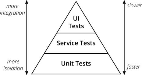
Above: Martin Fowler’s practical test pyramid (2012) — the pyramid shows test order from bottom to top, and illustrates the number of tests to conduct — the more high level you are on the pyramid, the fewer tests you should write.
Smith also touches on test design, and what makes up a good robust suite of tests, that the ‘cheapest’ test should give you confidence, stability and documentation. Smith defines testing as the quickest to write and run, and simplest to write, and runs on the cheapest resources. When you’re sometimes resource strapped and focused on development, this sort of mindset is invaluable in making sure the code is robust and will definitely be useful in future projects so that we can deploy with confidence.”
From Chloe:
“For me the Leonie Watson’s talk on accessibility stood out for me. She touched on how in Amazon’s Alexa you can implement extra features using Speech Synthesis Markup Language (SSML) inside Alexa’s JSON code, to enhance the conversational architecture and the huge difference it can really make. Whether Leonie is hearing about ‘fluffy kittens’ or a train crash, the monotone voice of Alexa says the same and can become quite repetitive and ‘boring’. Not only did this educate me on the use of the SSML (and JSON in general), it also gave me the insight into how we could implement more emotive synthesised speech into future projects. Bridging the gap between the flexibility of what can be said, and the emotive impact of that is hard, and when we’ve worked on voice assistant projects previously, actors saying set phrases have been preferred to give that emotional connection with the user.”
From Matt:
“The first rule of Media Queries is… do I need a media query?
From: @rachelandrew’s talk “The Evolution of CSS” at @FrontEndNorth
“Over the last few years we have been handed a whole set of new tools in CSS which allow our sites to respond to the environment of our user, and the shape of the content we are displaying.”
In other words, it is no longer acceptable to present a desktop site on a mobile device, have content hidden behind hovers for users on tablets or phones (not great practice anyway), or show animation to people who have specifically requested they aren’t shown it. Especially given the ever growing list of @media queries available.
However, the classic use case of Media queries in responding to screen sizes is no longer always necessary through the use of flexbox and grid, providing you allow the user’s browser to choose how the elements resize and place themselves to some degree. Media queries ought to be about enhancing the UX of your site, not about screen size.
So, as Rachel said, “Stop expecting people to fix something to use your website. Respond to meet them where they are”.
…unless you’re using <IE 11. Then upgrade or go away*. ¯\_(ツ)_/¯”
*Humble opinion of this developer.
From Kaz:
“The biggest take away from the conference for me was Leonie Watson’s talk on voice. Almost as an aside at the end of a talk on Amazon’s Alexa, she spoke about CSS attributes that can be used to add pace and emphasis to screen readers. We wouldn’t ever visually design a news article with the header, sub header and body copy all being the same size and weight, there’d be no hierarchy, so why would we not use the tools available to design an equal experience for a user who relies on a screen reader!
Accessibility and inclusion aren’t just tick boxes, we need to think about the experience that all humans have with our interfaces. During a recent project for the Science Museum in London, we designed the Kiosks for the new Medicine Galleries. We needed to make the experience accessible for all visitors to the galleries. The kiosks are fixed height screens, so we needed to think about the ergonomics of our interface for wheelchair visitors and make all interaction points reachable. Moving all interaction points to the bottom of the screen created an accessible experience for wheelchair users, but it also made the kiosks accessible for children who might not be tall enough to reach higher up the screen too. Designing for accessibility and inclusion can be low on the agenda for some, it creates additional constraints, and can add time to a project.
At Joi Polloi we’ve always endeavoured to create accessible experiences, so it’s great to learn how we can improve and make our experiences not just accessible, but also more enjoyable to those users too.”
From Josh:
“Stuart Robson’s talk showed an interesting approach to improve this flow — Design Tokens. It can often be a time consuming process to translate changes in design into a live environment. For example, if a designer changes a colour, the new design has to be sent to the developer, the new colour added to the code, and the site updated with the new code. This can quickly start to consume a lot of dev and design time. The idea behind this is that you break the design down into the component atoms — font sizes, colours, spacing, z-indexes, etc — and construct all styles only from those. You store these design tokens in an intermediate format, such as JSON or YAML (there are plugins beginning to pop up that will do this directly from your design tool e.g. Sketch), then they can be compiled straight into the CSS for the site using a program like Theo. This speeds up the workflow, as the designer only needs to update the design tokens file and the dev pull the new version. This approach also has the advantage that if you need to build on a new platform, there is no duplication of code — the design tokens file can simply be compiled into whatever style necessary, such as XML for Android, or JSON for iOS.”