We’ve done some work recently refreshing some existing online shops and I’m going to discuss our general approach to them. By refreshing I mean improving a shop’s user experience (increasing turnover), tied to a wider brand update, or simply from a desire to make things better. Ostensibly this is through a redesign & rebuild, improving the interface, but in order to make the most of any new redesign there’s always structural and content changes that should happen to the existing product catalogue.
If you think that your web-store is a bit confused or stale, or want some general pointers for improving it, here are some things look at. These things are free — or at least they only take your time and effort! They may even lead you to consider a fuller rebuild.
Part 1. Customers
Before doing anything, we do some research into who is using the site and how.
Who are your customers?
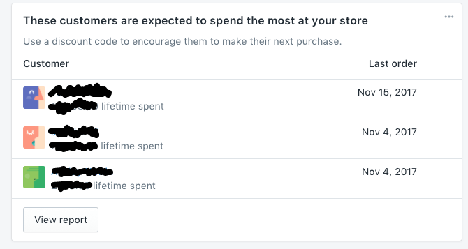
An obvious one, but it’s vital to have a good idea of who your customers are. Types of people, where they are, what products do they normally buy, what their purchase patterns are. Shopify’s admin dashboard has handy statistics panels, to help you get an idea of who’s buying what, and recommendations on what to do.
How do your customers use the site?
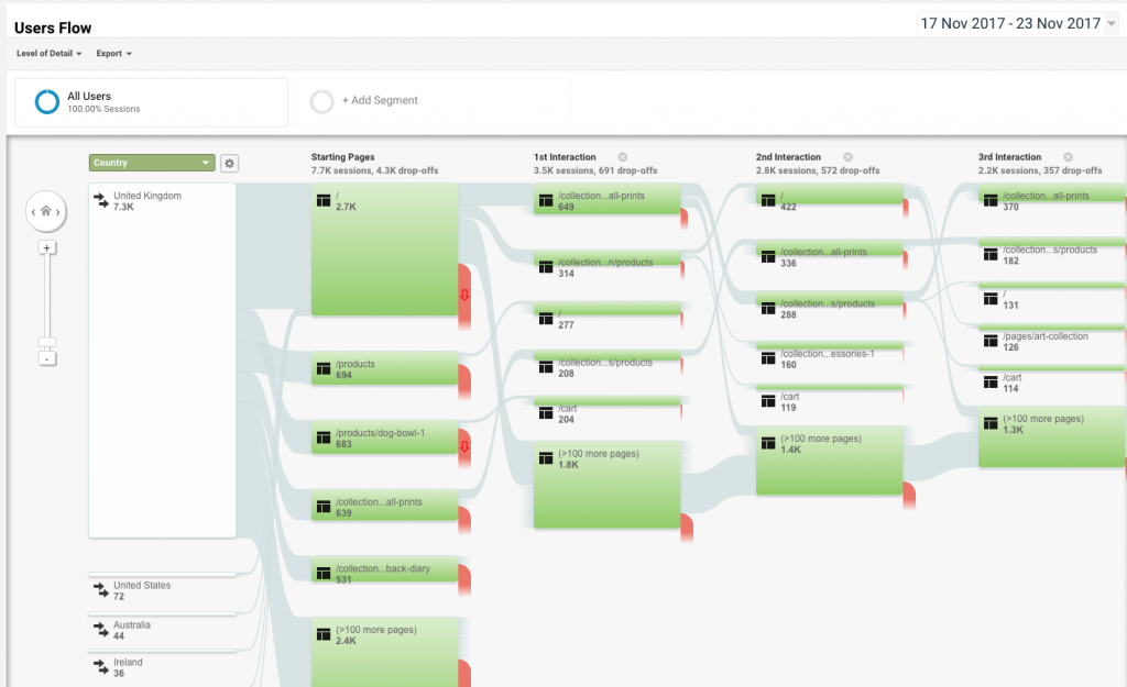
We use Google Analytics for this. We always ask for access to the analytics at the start of a project, so it’s best to have had it up and running for at least a few months to get some good data. Using the Google analytics interface can seem intimidating, but it is useful to try and dig out the following information:
- Which pages do people arrive on the site on — is it the home page, a category page, or a product page? If people are arriving at product pages, then it is important that each page imparts an idea of what the store is and what is also available — make it clear there is more to be had.
- Do people move around the site a lot? Do they generally just buy the one thing or things from different sections of the site? This will tell you if the site is promoting other product ranges or if the customers are getting ‘lost’. In which case there is a problem with the categories and navigation.
- Once people have selected their products, do they go smoothly through the Checkout process? It is important to make paying for the purchase as easy as possible to not leave items on the shelf or in the basket.
Customer feedback & complaints
Do you have a list of feedback from customers, either in emails, tweets, Facebook posts etc.? Gather them together, are there common threads in them, or common complaints. Deal with them on the site, or use them as a basis for improvements.
Missing customers
Looking at the information that’s been gathered above, we often ask the shop owner if it’s what they expected . The purchase patterns may not be what was originally thought — which leaves two options; embrace it and cater for those customers you have, or try and find those original customers.
Part 2. Improve the Products and their Categories
Getting an idea of who your customers are, their preferences and dislikes, gives a prism through which to look at what is being sold. Everything we do from this part onward is from the perspective of those customers.
Products
Do the products have meaningful descriptions which do service to the product? Often a product page can end up quite scant, with a thumbnail and a short description as you have to upload and manage a lot of products. But is this enough to actually convince someone to buy it? The customer will only see a few of the products, they’re more interested in the details of a single product, over the multitude of different products. For example, if it’s a physical product it’s important that the customer can get an idea of what it will be like physically — how big is it, how heavy, what’s it made of.
Rewrite the descriptions to include dimensions and an idea of what sets this product apart from the rest, what might your particular customers value in the product? A personal take on it always helps — what is your opinion of it, are there any customer recommendations?
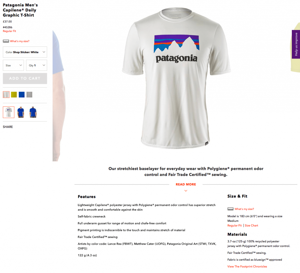
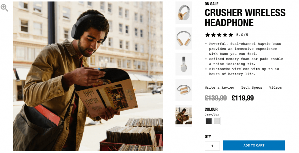
Images are a must. Often there is only one thumbnail image which does nothing to make the product stand out, or give it any desirability. A product should have a good gallery of images which aim to convey what the product will be like when it arrives, and how it will fit into and enhance the customer’s life. Add images to show:
- The product in a realistic/desirable setting — help the customer see how it would look in their life.
- The product next to some kind of measurement, maybe with a ruler on it, or showing it next to something with a commonly understand size (a door, a car a plant etc.).
- If quality is a key component, a really close up picture of part of the product will show things like the material, or the finish.
- Pictures of the product from different angles.
Warning: this is probably the job you’ve been avoiding – it takes a lot of work, but it can do a lot for your store.
Categories
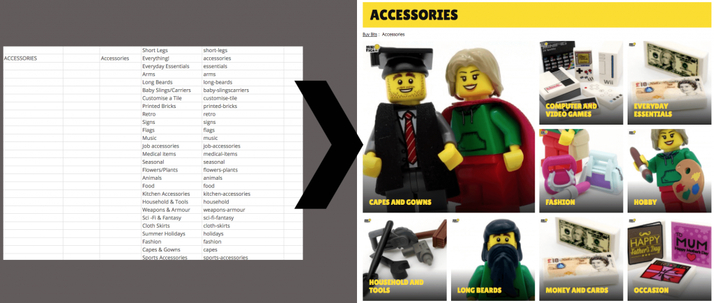
Are products organised into categories that make sense to the customer? (If you sell vinyl music, there’s no point organising everything alphabetically, if customers prefer to browse by genre — remember online stores allow you to have a product in multiple categories, unlike a physical store).
Try making a list (or spreadsheet) of all your products (if you have a lot of products, take a random sample). Organise them into groups based around what you know of how customers look for them. Look at what products are purchased together, is there a similar grouping?
Featured Products
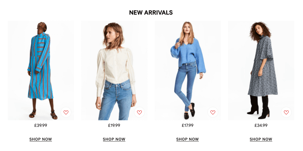
It’s tempting to list everything on the front page of a store, but instead the customer should be given a curated list of what they might like — you should regularly change this — but give your customers a deep, but not overwhelming, list of choice.
Remember that the homepage should give a good overview of what the shop generally sells (cars, clothes, furniture), and it’s approach (quality, uniqueness, value), not necessarily every product.
Conclusion
These improvements are a long job, well worth it to make the most without splashing out on a full rebrand. With these things looked at it’s easier to see if the platform & design should be improved.
If you’d like us to work anything mentioned in this article, please do drop us a line.
If you’re using Shopify, we’ve some specific tips here.