February 2018 - Joi Polloi

As we’ve been redesigning our website, it’s given us an opportunity to look back over some of our recent work. We asked the team to pick out some of their favourite projects we’ve worked on over the last 12 months…

My Glasto Lineup for BBC Creative

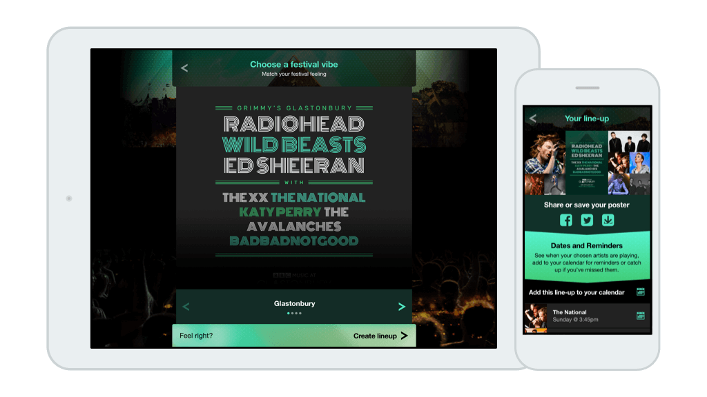
We worked with BBC Creative to create a microsite to promote BBC Music’s coverage of the Glastonbury Festival. It let viewers and listeners create their own personalised Glasto lineup poster to share with friends, and then add reminders to their phone’s calendar so they wouldn’t miss any of their favourite artists’ performances. Over 120,000 people created their own posters.

John, one of our senior developers says“Favourite project for me was Glastonbury; we created something really funky using my favourite framework React. Perhaps best of all it was used by loads of peeps and got lots of traction on the social medias.”

Screenshots of My Glasto Lineup site

See the microsite here:
www.myglastolineup.co.uk

Watch a case study video here:
www.bbccreative.co.uk/projects/bbc-music-glasto-lineup/

Animal Rescue Live

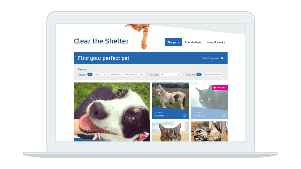
Last summer Channel 4 launched a new show, Animal Rescue Live: Supervet Special, which aimed to draw attention to the many animals in charity shelters in need of rehoming. Broadcast live for a week from Newcastle Cats and Dogs home, we created a vital online component for their new live show, a website which allowed viewers to apply to adopt the featured animals, and behind-the-scenes, for applicants to be properly vetted (pun intended).

We created a system which stood up to the sudden traffic of a live show, handling hundreds of thousands of users over the course of the week. Most importantly there was an amazing response from the audience wanting to adopt the pets from show; we received almost 2,000 applications and helped find homes for Cedric the pig, Sausage the parrot, four shy goats, and many others.

Andy, our MD says: “Of all the work we do here at Joi Polloi, perhaps the most rewarding for me are those that have real world impact. In this project we did just that, directly re-homed many pets, enriched countless lives and indirectly realised a huge national boost in animal adoption throughout the campaign and beyond.”

Screenshot of Animal Rescue Live website

Rewatch the series here:
www.channel4.com/programmes/animal-rescue-live-supervet-special

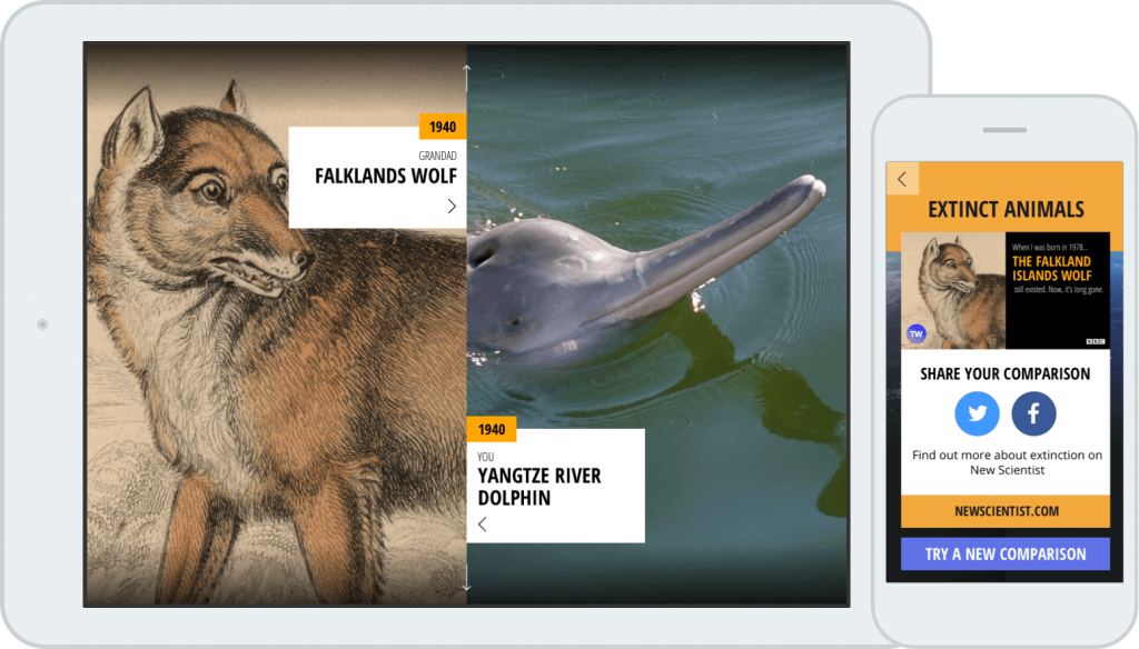
BBC Tomorrow’s World: Global Change Calculator

The BBC has brought back the Tomorrow’s World brand! We were hugely excited to create an interactive experience to give you an insight into how dramatically the world has changed in your lifetime, and in that of your relatives.

The aim was to illustrate the huge advances in science and technology, and global changes over the years, by showing them in a context which is very personal to the user.

A huge amount of data is contained within the site, in order to create a unique and personal journey for every visitor.

Karen, our senior designer“The Global Change Calculator stood out for me; it was a really interesting project and we had a lot of creative input. The BBC were superb to work with, they’re really knowledgeable and also trusted us creatively. It was challenging to make the experience impactful on mobile, tablet and desktop, but we achieved it.”

Screenshot of the Global Change Calculator

Recently we’ve done a couple of projects with Shopify, which is becoming our small-to-medium eCommerce solution of choice. This short post is going to focus on Shopify from Joi Polloi’s perspective, and some things we’ve done with it to squeeze the most out of the stores we’ve made. I’ve got some views on other general platform-free improvements we’ve made to web stores, which can be seen here.

The big sell for clients to go with Shopify is the cost. It comes in three plans; ‘Basic Shopify’ and ‘Shopify’ are affordable — whilst the ‘Advanced Shopify’ is a big jump up. Our clients are normally on the medium ‘Shopify’ plan, and we do a few things to get the most from it — everything I’ve written below is for this plan.

The interface for Shopify is very friendly for both the customers and staff. As it is a dedicated eCommerce platform (not a plugin for another CMS, as in the case of WooCommerce) everything you see is purpose built to make selling and managing stock as simple as possible. For us, the codebase is good and it’s easier to build and customise it without running into odd problems — so we can deliver more for the project.

A fantastic feature is the Shopify’s Polaris interface for creating great looking shops, and it works well with our design tool of choice Sketch.

Example of Shopify’s admin area

Versatile ways of arranging your shop

Shopify has a somewhat flat collection structure — there is no nesting or hierarchy to the collections. When we approached laying out Pete Mckee’s online shop, we had to take on board the requirements for an artist and his work, who sells individual paintings/objects, and also arranges their work into thematic ‘art collections’. For a fashion clothing analogy, a Winter collection will include tops, trousers, shoes and scarves. Ordinarily these also live in different collections according to their product type (shoes from all collections, all tops etc.). Shopify can handle this easily, products can be in 2 collections at once easily enough. But what if you want a general overview page which lists all the collections?

By default Shopify will try and list the collections like Winter alongside the category type collections (Shoes, Tops etc.). Not a very pretty site. Switching back to our Mckee shop it meant that our artist’s latest range of ‘6 Weeks to Eternity’ was listed alongside a category called Accessories. To make matters worse the collections were arranged by view of the page shows everything in date, or alphabetical order.

Before: Mixing the artistic categories with the physical formats — not good

We worked around this by making a new menu called ‘Art Collection’. Normally used for page navigation — here we create it and order the ‘art collections’ the way we want. Then we make another page with a custom template to show the items in this menu — and magic, a beautiful page to showcase art by editorial choice — not just by type.

Driving the art collections with a custom menu
After: Only the curated art collection shows

Click and Collect

A feature we developed for the University of Sheffield Student’s Union shop was Click and Collect. This is a feature of the higher tiered version of Shopify but not the standard version. By default Shopify will apply the cheapest value shipping to an item, defined by weight of the product. This means if there is a click and collect option — when the customer collects the item from the shop, which is usually free — then it becomes the default option. This quickly can mean that shops end up out of pocket, as the customer doesn’t notice and pays for the product only and not postage.

For the customer our solution is a painless ‘Collect this order for free’ check box on the basket page. In the background it secretly adds a zero-value, but very heavy item to the basket. This very heavy items put the entire order into a special heavy postage category, setup to have zero value — so the whole order becomes postage free!

It’s a bit of a hack, but for the user click-and-collect is easy to use

Displaying products on other sites

The last novel things we’ve played around with is pulling Shopify products to other sites purely through the API. Our work on Mckee actually created two different platforms, made to appear to be one. The front of the site is actually a different back end system, that leads to the shop area. We found it easy and simple to set up a ‘featured’ collection on the webstore, and then automatically pull all the items from this into the promotion site, creating a slick and striking way of promoting your products, without looking too sales focussed.

The site’s homepage pulling shop items through (controlled by from the shop)

Thereotically you could built the entire store this way, which’d be interesting to try out.

That’s all for now, but if we have any more Shopify hints and tricks, we’ll update this, and if you have any thoughts, or want to see how this could work for you, please get in touch!

Thanks.

We’ve done some work recently refreshing some existing online shops and I’m going to discuss our general approach to them. By refreshing I mean improving a shop’s user experience (increasing turnover), tied to a wider brand update, or simply from a desire to make things better. Ostensibly this is through a redesign & rebuild, improving the interface, but in order to make the most of any new redesign there’s always structural and content changes that should happen to the existing product catalogue.

If you think that your web-store is a bit confused or stale, or want some general pointers for improving it, here are some things look at. These things are free — or at least they only take your time and effort! They may even lead you to consider a fuller rebuild.

Part 1. Customers

Before doing anything, we do some research into who is using the site and how.

Who are your customers?

An obvious one, but it’s vital to have a good idea of who your customers are. Types of people, where they are, what products do they normally buy, what their purchase patterns are. Shopify’s admin dashboard has handy statistics panels, to help you get an idea of who’s buying what, and recommendations on what to do.

How do your customers use the site?

We use Google Analytics for this. We always ask for access to the analytics at the start of a project, so it’s best to have had it up and running for at least a few months to get some good data. Using the Google analytics interface can seem intimidating, but it is useful to try and dig out the following information:

  • Which pages do people arrive on the site on — is it the home page, a category page, or a product page? If people are arriving at product pages, then it is important that each page imparts an idea of what the store is and what is also available — make it clear there is more to be had.
  • Do people move around the site a lot? Do they generally just buy the one thing or things from different sections of the site? This will tell you if the site is promoting other product ranges or if the customers are getting ‘lost’. In which case there is a problem with the categories and navigation.
  • Once people have selected their products, do they go smoothly through the Checkout process? It is important to make paying for the purchase as easy as possible to not leave items on the shelf or in the basket.
Analytics providing a map of users going through a shop we made for www.petemckee.com

Customer feedback & complaints

Do you have a list of feedback from customers, either in emails, tweets, Facebook posts etc.? Gather them together, are there common threads in them, or common complaints. Deal with them on the site, or use them as a basis for improvements.

Missing customers

Looking at the information that’s been gathered above, we often ask the shop owner if it’s what they expected . The purchase patterns may not be what was originally thought — which leaves two options; embrace it and cater for those customers you have, or try and find those original customers.

Part 2. Improve the Products and their Categories

Getting an idea of who your customers are, their preferences and dislikes, gives a prism through which to look at what is being sold. Everything we do from this part onward is from the perspective of those customers.

Products

Do the products have meaningful descriptions which do service to the product? Often a product page can end up quite scant, with a thumbnail and a short description as you have to upload and manage a lot of products. But is this enough to actually convince someone to buy it? The customer will only see a few of the products, they’re more interested in the details of a single product, over the multitude of different products. For example, if it’s a physical product it’s important that the customer can get an idea of what it will be like physically — how big is it, how heavy, what’s it made of.

Rewrite the descriptions to include dimensions and an idea of what sets this product apart from the rest, what might your particular customers value in the product? A personal take on it always helps — what is your opinion of it, are there any customer recommendations?

Patagonia do a great with size and fit sections to allow customers to get a feel for the product

Images are a must. Often there is only one thumbnail image which does nothing to make the product stand out, or give it any desirability. A product should have a good gallery of images which aim to convey what the product will be like when it arrives, and how it will fit into and enhance the customer’s life. Add images to show:

  • The product in a realistic/desirable setting — help the customer see how it would look in their life.
  • The product next to some kind of measurement, maybe with a ruler on it, or showing it next to something with a commonly understand size (a door, a car a plant etc.).
  • If quality is a key component, a really close up picture of part of the product will show things like the material, or the finish.
  • Pictures of the product from different angles.

Warning: this is probably the job you’ve been avoiding – it takes a lot of work, but it can do a lot for your store.

Skull Candy showing what kind of lifestyle you could be living with their headphones

Categories

Are products organised into categories that make sense to the customer? (If you sell vinyl music, there’s no point organising everything alphabetically, if customers prefer to browse by genre — remember online stores allow you to have a product in multiple categories, unlike a physical store).

Try making a list (or spreadsheet) of all your products (if you have a lot of products, take a random sample). Organise them into groups based around what you know of how customers look for them. Look at what products are purchased together, is there a similar grouping?

On minifigs.me we re-organised over 1,300 products into more user intuitive categories

Featured Products

It’s tempting to list everything on the front page of a store, but instead the customer should be given a curated list of what they might like — you should regularly change this — but give your customers a deep, but not overwhelming, list of choice.

Remember that the homepage should give a good overview of what the shop generally sells (cars, clothes, furniture), and it’s approach (quality, uniqueness, value), not necessarily every product.

H&M’s homepage has a ‘New Arrivals’ area for simple impulse purchases

Conclusion

These improvements are a long job, well worth it to make the most without splashing out on a full rebrand. With these things looked at it’s easier to see if the platform & design should be improved.

If you’d like us to work anything mentioned in this article, please do drop us a line.

If you’re using Shopify, we’ve some specific tips here.