Uncategorised Archives - Page 4 of 4 - Joi Polloi

We’ve done some work recently refreshing some existing online shops and I’m going to discuss our general approach to them. By refreshing I mean improving a shop’s user experience (increasing turnover), tied to a wider brand update, or simply from a desire to make things better. Ostensibly this is through a redesign & rebuild, improving the interface, but in order to make the most of any new redesign there’s always structural and content changes that should happen to the existing product catalogue.

If you think that your web-store is a bit confused or stale, or want some general pointers for improving it, here are some things look at. These things are free — or at least they only take your time and effort! They may even lead you to consider a fuller rebuild.

Part 1. Customers

Before doing anything, we do some research into who is using the site and how.

Who are your customers?

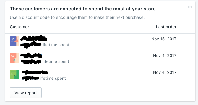
An obvious one, but it’s vital to have a good idea of who your customers are. Types of people, where they are, what products do they normally buy, what their purchase patterns are. Shopify’s admin dashboard has handy statistics panels, to help you get an idea of who’s buying what, and recommendations on what to do.

How do your customers use the site?

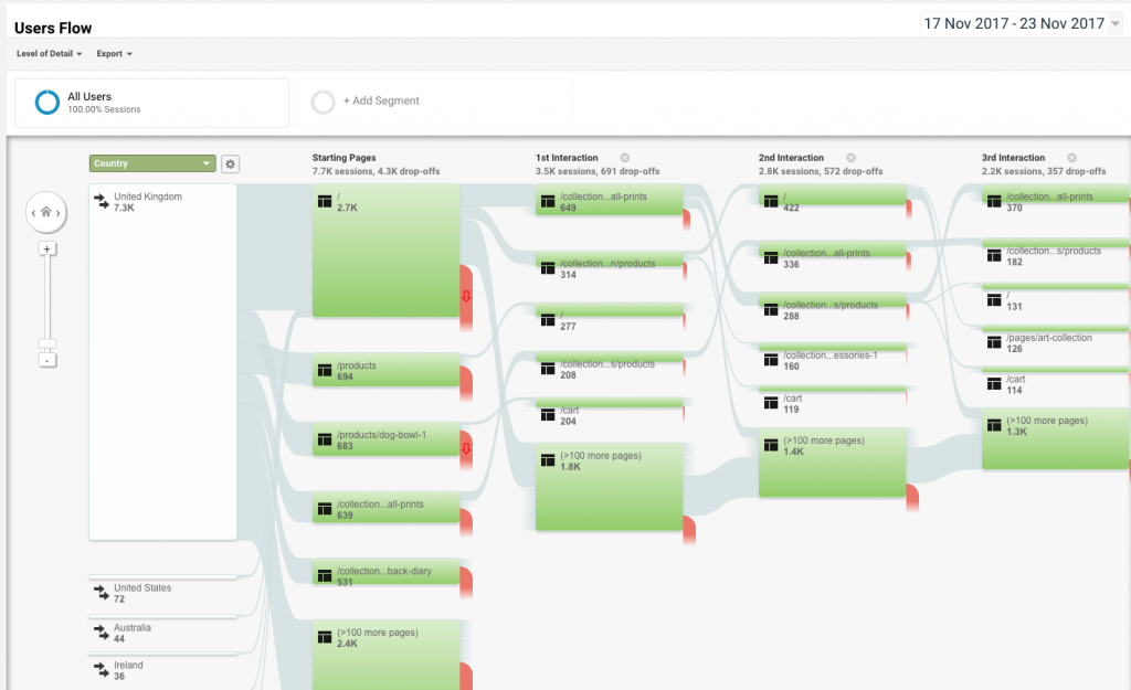
We use Google Analytics for this. We always ask for access to the analytics at the start of a project, so it’s best to have had it up and running for at least a few months to get some good data. Using the Google analytics interface can seem intimidating, but it is useful to try and dig out the following information:

  • Which pages do people arrive on the site on — is it the home page, a category page, or a product page? If people are arriving at product pages, then it is important that each page imparts an idea of what the store is and what is also available — make it clear there is more to be had.
  • Do people move around the site a lot? Do they generally just buy the one thing or things from different sections of the site? This will tell you if the site is promoting other product ranges or if the customers are getting ‘lost’. In which case there is a problem with the categories and navigation.
  • Once people have selected their products, do they go smoothly through the Checkout process? It is important to make paying for the purchase as easy as possible to not leave items on the shelf or in the basket.
Analytics providing a map of users going through a shop we made for www.petemckee.com

Customer feedback & complaints

Do you have a list of feedback from customers, either in emails, tweets, Facebook posts etc.? Gather them together, are there common threads in them, or common complaints. Deal with them on the site, or use them as a basis for improvements.

Missing customers

Looking at the information that’s been gathered above, we often ask the shop owner if it’s what they expected . The purchase patterns may not be what was originally thought — which leaves two options; embrace it and cater for those customers you have, or try and find those original customers.

Part 2. Improve the Products and their Categories

Getting an idea of who your customers are, their preferences and dislikes, gives a prism through which to look at what is being sold. Everything we do from this part onward is from the perspective of those customers.

Products

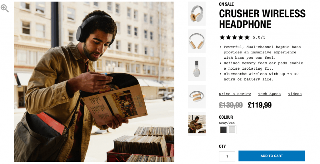
Do the products have meaningful descriptions which do service to the product? Often a product page can end up quite scant, with a thumbnail and a short description as you have to upload and manage a lot of products. But is this enough to actually convince someone to buy it? The customer will only see a few of the products, they’re more interested in the details of a single product, over the multitude of different products. For example, if it’s a physical product it’s important that the customer can get an idea of what it will be like physically — how big is it, how heavy, what’s it made of.

Rewrite the descriptions to include dimensions and an idea of what sets this product apart from the rest, what might your particular customers value in the product? A personal take on it always helps — what is your opinion of it, are there any customer recommendations?

Patagonia do a great with size and fit sections to allow customers to get a feel for the product

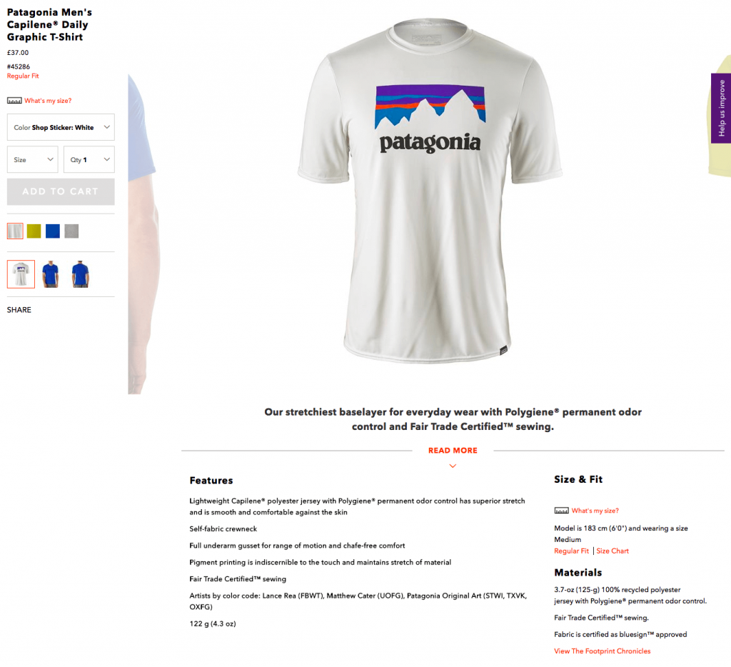
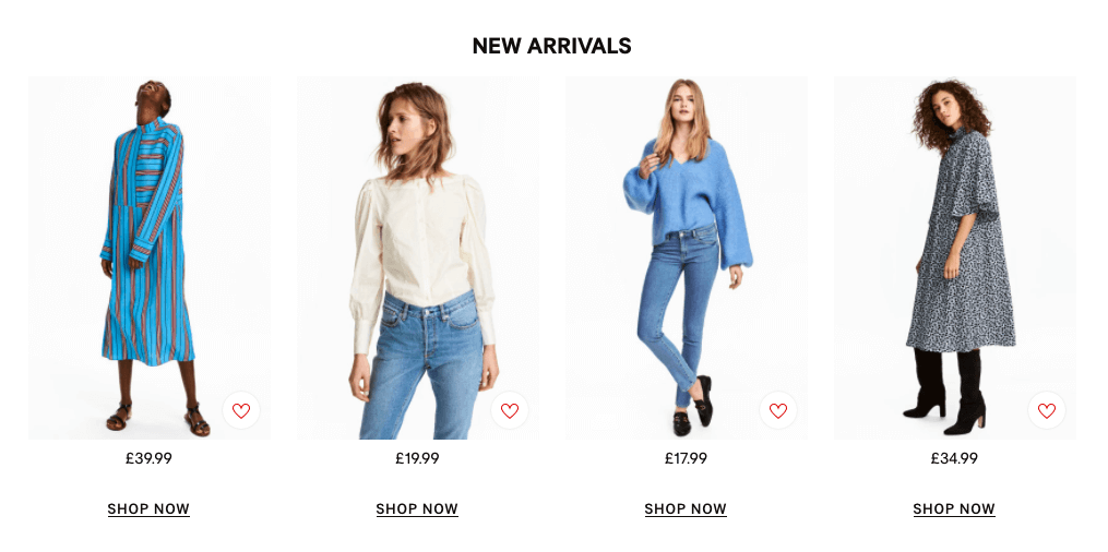
Images are a must. Often there is only one thumbnail image which does nothing to make the product stand out, or give it any desirability. A product should have a good gallery of images which aim to convey what the product will be like when it arrives, and how it will fit into and enhance the customer’s life. Add images to show:

  • The product in a realistic/desirable setting — help the customer see how it would look in their life.
  • The product next to some kind of measurement, maybe with a ruler on it, or showing it next to something with a commonly understand size (a door, a car a plant etc.).
  • If quality is a key component, a really close up picture of part of the product will show things like the material, or the finish.
  • Pictures of the product from different angles.

Warning: this is probably the job you’ve been avoiding – it takes a lot of work, but it can do a lot for your store.
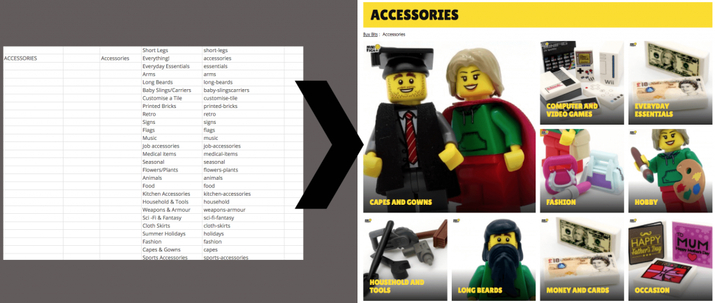
Skull Candy showing what kind of lifestyle you could be living with their headphones

Categories

Are products organised into categories that make sense to the customer? (If you sell vinyl music, there’s no point organising everything alphabetically, if customers prefer to browse by genre — remember online stores allow you to have a product in multiple categories, unlike a physical store).

Try making a list (or spreadsheet) of all your products (if you have a lot of products, take a random sample). Organise them into groups based around what you know of how customers look for them. Look at what products are purchased together, is there a similar grouping?

On minifigs.me we re-organised over 1,300 products into more user intuitive categories

Featured Products

It’s tempting to list everything on the front page of a store, but instead the customer should be given a curated list of what they might like — you should regularly change this — but give your customers a deep, but not overwhelming, list of choice.

Remember that the homepage should give a good overview of what the shop generally sells (cars, clothes, furniture), and it’s approach (quality, uniqueness, value), not necessarily every product.

H&M’s homepage has a ‘New Arrivals’ area for simple impulse purchases

Conclusion

These improvements are a long job, well worth it to make the most without splashing out on a full rebrand. With these things looked at it’s easier to see if the platform & design should be improved.

If you’d like us to work anything mentioned in this article, please do drop us a line.

If you’re using Shopify, we’ve some specific tips here.

It’s great to get out of the office for a day of creativity and inspiration especially if that can be found (nearly) on your doorstep.

I made the short journey up to York with my colleagues Karen and Dale to attend the DotYork conference. Though it’s been running for a few years this was our first visit.

Live speech by Ian Worley
Ian Worley inspires us to shoot for the moon, rather than be dragged into the poo

There were a whopping 16 speakers on the bill over 4 sessions which meant short-ish talks. There were definitely some speakers you were left wanting to hear more from.

One of the talks I found most memorable was Hannah Nicklin, a freelance game writer and designer, who took a very distinctive approach to tell us about Klondike, a French video game collective.

Presenting the Klondike Collective

The Dummy’s Guide to presenting tells you never to just read from a script. Citing that her talents lay in writing rather than public speaking, she did a wonderful performance of her poetic and passionate description of the collective’s story and philosophy, which counterpointed sound business advice with passionate calls to destroy capitalism.

Live speech by Hannah Nicklin
DESTROY CAPITALISM says Hannah Nicklin (except for buying a copy of her book)

It was interesting and inspiring to lay out the varying definitions of a “collective”, and its connotations, and implied values over calling yourself a commercial company. Ultimately this comes down to having a strong sense of the purpose and values both of the organisation, and the things that it produces.

She described how their only rule is that there are no rules about what they can and can’t produce. Not being constrained by a house style, or institutional “wisdom”.

Particularly interesting was how they are a fixed sized, closed membership organisation — giving the feeling of a special, elite club that not everyone will achieve entry to.

What we brought back

Many of the ideas Hannah expressed in the talk seemed very relevant to our work here at Joi Polloi, reflecting some of the values we attempt to apply to our business and work.

The idea of the collective, with non-hierarchical structures is, in some ways, the default for any small business, but as we have grown, we have attempted to cultivate a culture of genuine co-operation across the company while still retaining individuals’ responsibility for creative ownership and quality. We have no desire to grow to be a huge, corporate bohemoth, if it means compromising these values.

Similarly being tied into a formulaic way of working, or a rigid house style is never something we have aimed for.

And while we can’t claim to be actively smashing capitalism, it’s always good to be reminded that doing things in your own, authentic way always wins — whether that’s structuring your business, in your creative work, or in how you present to conferences.

Using regular expressions to turn a postcode into a UK constituency — purely on the client (no databases). Our developer, John, looks back at some data crunching he did for the 2015 general election

It was ten to seven on a Saturday morning in late March. Curlicues of vapour drifted up from a cup of coffee as I waited for my development environment to boot up. It was a little over a month until the 2015 UK general election.

The day before I had put the final (developer speak, not actually final) touches to a tool that would allow visitors to Channel 4’s “X” campaign site to enter their postcode and see a breakdown of the political parties that had run in the 2010 general election. In essence, it would show by how much of a margin the winning party had won by and the difference a vote, your vote, could make.

The tool itself was, by today’s standards, unimaginative. Searching for a postcode with open data from the Office of National Statistics and the Ordnance Survey was trivial and a far cry from the days of the Post Office holding onto that data like a precious stone (which ironically is about how much it used to cost to purchase access to that data). One REST API call later and a blob of political party JSON was returned to the searcher. Job done, dust off hands, go home.

Only that REST API was a clutch of moving parts. It required a database, at least one web server each with a scripting language interpreter… that was a lot that could go wrong. And things do go wrong, and with a dwindling number of days to go before the site’s launch, testing that setup and infrastructure was a huge investment in time. It had to be robust.

So there I was the next morning, with the question lingering: what if?

What if that unimaginative REST API wasn’t needed and the postcode search could be done all on the client side? It would obviate the need for all those moving parts, but the very idea is lunacy, surely? At the time, there were about 2.5 million unique UK postcodes and 650 parliamentary constituencies. If you were to blob all of that information into, say, a CSV file, it would be over 1GB in total. That’s a staggering amount of data for a desktop browser to parse, let alone a mobile device (and the user’s data plan).

So how to make all that data suitable for web browsers without an external API?

Optimisation, computer science style

So starting with a small sample of data for Sheffield Central, let’s step through how to optimise it.

S10 2DJ, Sheffield Central

S10 2DL, Sheffield Central

S10 2DN, Sheffield Central

S10 2DR, Sheffield Central

S10 2DS, Sheffield Central

S10 2DU, Sheffield Central

S10 2DW, Sheffield Central

If we were to send this data as-is, as well as taking a long time to search through — we would have to check every single line to find an entered postcode — there’s a lot of repetition. The first thing to do is change “Sheffield Central” into a number:

S10 2DJ, 1

S10 2DL, 1

S10 2DN, 1

S10 2DR, 1

S10 2DS, 1

S10 2DU, 1

S10 2DW, 1

We then only have to send the string “Sheffield Central” once and afterwards can look it up using the number. But there’s still a lot of repetition: we’re effectively sending “S10 2D” seven times which seems wasteful. To optimise this we have to change the structure of the data from the simple to understand table format into a tree:

S10 2D -> [J, L, N, R, S, U, W] -> 1

The structure — as well as making me sound like a mad arborist — allows us to infer things about the data that a table didn’t: if someone entered “S10 2D”, there are only seven possible ways to complete that postcode. Obviously our data set is quite small, but with the structured format of postcodes, this way of representing our data becomes very powerful.

Only we’re still kind of repeating ourselves. In our test data we don’t actually need to know how the postcode ends because all roads lead to Sheffield Central:

S10 2D -> 1

So we’ve gone from seven lines and 188 characters to one line and 12 characters without losing any information. This kind of optimisation works because we have a very limited “target” set of data — the 650 parliamentary wards. If we had a much larger data set, for instance, the latitude and longitude for each postcode (so called “geocoding”) then this optimisation wouldn’t work as well, if at all.

Scaling this kind of optimisation up from our seven postcodes to 2.5 million nets a huge saving in both size and search speed; so much so that if you break up the data according to the first letter of the postcode, the result is something that can indeed be transferred to a visitor’s web browser and run there with no need for an API.

Success! Call my agent I’m moving to Silicon Valley. Right? It was still Saturday morning, my proof of concept had worked. I took a celebratory shower and then that niggling question formed: but what if?

We need to go smaller

There’s a saying in our office: if you have a problem, regardless of what it is, you can solve it one of two ways. With flexbox. Or with regular expressions. Frontend layout problems? Flexbox. Data integrity issues? Regular expressions. Car got a flat tire? Flexbox (probably).

The issue I was seeing with what we had above is that, like Communism, in theory it works brilliantly, but parliamentary constituency boundaries are bonkers in practice. So imagine if all but one of our sample data set ended in Sheffield Central and the other went to Sheffield Hallam? Our optimisation steps would actually end up like:

S10 2D -> [J, L, N, R, S, U] -> 1

-> [W] -> 2

We now have to worry about how all S10 2D postcodes end all because of S10 2DW. Thanks a lot guy. This situation didn’t happen in just one or two constituencies either. This means that more data needs to be stored (and transferred) to retain the same information, and more data means unhappier mobile data plan users.

What to do then? I had a fresh cup of coffee and an attitude of reckless abandon so it was time to start getting silly.

The first thing I did was “collapse” those final, one letter, steps into their own single step:

S10 2D -> JLNRSU -> 1

-> W -> 2

This may not immediately be an obvious optimisation but when the data structure (in this case JSON) is taken into account, the overhead for each additional step makes a huge difference at scale. This step does mean our search becomes slightly more complex, but at just the penultimate step this is manageable. So if more steps mean more overhead, wouldn’t it be easier just to collapse more steps? E.g.

S10 2D(JLNRSU) -> 1

S10 2DW -> 2

At this point our toy data set is becoming less useful as an example, but the sin that I committed is becoming manifest.

It’s alive!

The thing about our office saying is that while flexbox and regular expression are very powerful tools, they are powerful precisely because of their complexity. And because flexbox isn’t going to be any use here (gut feeling), that means I opted for regular expressions.

I created a program that creates regular expressions. I created a monster. A monster that spits out things like:

(1(AE|B[ABDEGHJLNPS-UX-Z]|E[ABD-HJLNP-RTUW-Z]|F[ABL]|G[ADJN]|P[E-HJZ]|Q[ABD-HJLR]|[DJ])|2[ABD-HJLNP-U]|3(A[AE]|B[ABDEHJLNWZ]|D[ABD-HLS-U]|E[BNPQ]|F[NQWX])|5(B[ABDEHJLNP-UW-Y]|D[ABD-FHJLNUWY]|F[BH]|[AE]))

That coincidentally is the regular expression for the S10 postcode for Sheffield Central (link to regexr and regexper).

The grotesque beauty of using regular expressions as well as our tree data structure is that we can tune the regular expressions so that they aren’t unmanageable by a visitor’s browser. Too long an expression and the time it takes to compute it would be a hindrance on under powered devices. Too short an expression and the space saving benefits are lost. So our data structure, with actual data behind it, looks something like:

S -> 1 -> 0 -> (1(AE|B[ABDEGHJLNPS-UX-Z]|E[ABD-HJLNP-RTUW-Z]|F[ABL]|G[ADJN]|P[E-HJZ]|Q[ABD-HJLR]|[DJ])|2[ABD-HJLNP-U]|3(A[AE]|B[ABDEHJLNWZ]|D[ABD-HLS-U]|E[BNPQ]|F[NQWX])|5(B[ABDEHJLNP-UW-Y]|D[ABD-FHJLNUWY]|F[BH]|[AE])) -> 1

Results

So what exactly does this… perversion of common sense get us? I’ve steered clear from the numbers behind the optimisation above because it’s easy to become a bit blind when throwing numbers around like frogs at a rocket launch.

But if we take all of the postcodes that begin with an S and transferred a huge CSV (like we started with), the total transfer would be ~3.5MB. After a couple of steps of optimisation with a basic tree structure, the total transfer would be ~1.4MB — a full 41.70673157% of the original. After another step of optimisation and “collapsing” the penultimate level of the tree, the total transfer would be 363KB — only 10.499084982% the size of the original. And then with the final, monstrous regular expression version, the total transfer was ~151KB or 4.3670913387% the size of the original. That last step also includes the constituency information (votes for each party that took party) so isn’t the true size of the postcode data but is the size of the file put into production.

And the “S” postcodes are the largest set, many like “K”, “F” or “Y” barely reach 20KB — smaller than many other assets that go into a modern webpage and smaller still if sent compressed.

The last lap

Sunday afternoon, feeling somewhat unclean about what I had created, I closed my development environment. I was giddy like I’d just done something nefarious, but this would work. It would work, right?

Back in on Monday and sure enough, it worked. Not quite believing it myself, I knocked together a test script that compared every single postcode against the results of the API (authoritative) and the homunculus-like files I had created. No failures. I ran it again just to make sure.

All that was left was integration with the frontend which, thanks to some early use of React, was done in a matter of minutes. For the best possible first-time interaction I also added all of the JSON files as advisory pre-load resources, meaning modern browsers would pre-cache the JSON files so there would be little to no waiting when I requested them (based on the first letter a visitor put into the search box).

Before I even had time to bask in the grimy light of success, the project was live. The client was happy because now the entire site could be hosted on Amazon S3 rather than custom infrastructure and I like to imagine every single visitor to the site marvelled and cooed at how quickly they could search for parliamentary constituencies.

Sure that wasn’t the end of the story — I mean how was I to know the data set I was using didn’t include Northern Ireland postcodes? Or that postcodes could be coded in different ways according to their location (literal edge cases)? But they were minor hiccups in the launch of a much used tool that delivered more than the client asked for and was a (relatively) fun exercise for the developer. As I’ve said before, if something is worth engineering, it’s worth over-engineering.

It was great last night to see TWO science shows on TV which used interactive technology to help its viewers participate in them in a real and meaningful way.

Citizen science gives researchers access to enormous sample sizes, or breaks big problems down into tiny pieces which each require a human to complete them. It would take a researcher a long time to examine 10 million images — it’s a lot easier if 1 million people can examine 10 images each. Television has the power to instantly recruit those numbers of volunteers, and let them take part immediately on their smartphones.

Television has the power to instantly recruit millions of volunteers.

Here at Joi Polloi we’ve worked on several projects like this in the past, where data from millions of tests (which tell each individual taking them something about themselves) is used by academic researchers.

The results of the Psychopath Test for Channel 4 were analysed to provide the largest ever sample in research into the traits of psychopathy.

In Embarrassing Bodies: My MindChecker which we worked on with Maverick TV for Channel 4, the results of the Autism test were analysed by the University of Cambridge and a research paper was published.

This week’s programmes which caught my eye were…

Stargazing Live

Screengrab of BBC iPlayer - Stargazing Live

Stargazing Live on BBC2 has run several citizen science experiments over their past 7 series, but the current one may be the most exciting — helping astronomers to discover a new planet. It asks viewers to identify objects in photos of the night sky which are a different colour from the background.

It ties in closely with the editorial content of the TV show because the photos were taken by the telescope in Australia where this series is being broadcast from.

Because the show is live over the course of a week, any interesting discoveries can immediately be checked out by the science team, and included in later shows. The interaction (which uses the Zooniverse platform) is designed to be addictive — will the next photo you’re given be the one which contains that elusive discovery?

Screengrab of Zooniverse website
The Zooniverse activity viewers were asked to complete

Update: over 5 million images have been reviewed in 3 days.

Gravity and Me

Gravity and Me on BBC4 was a personal investigation by physics professor Jim Al-Khalili into the history and science of gravity. One of the key points of the programme was that gravity is not a constant force — but it changes based on our speed and altitude — and according to Einstein, changes in gravity also affect time.

Smartphone app screengrab

A few months ago they released an app which used your smartphone movement and GPS data to track the tiny differences in gravity affecting you, and how that affected the passage of time. Pretty mind-blowing stuff! During the programme they admitted that they’d got the complicated equations wrong on the app. It wasn’t quite clear if/when these were corrected in the app, but according to the app, over the last few months I’ve aged by 611 nanoseconds more than someone static at sea level. Which explains a lot!

Both these examples show that the power of broadcast TV, combined with interactive content, has the power to engage millions of people in science experiments with very real and exciting outcomes.

We’re working on more similar TV Citizen Science projects at the moment — if we can share our expertise with you, please get in touch via www.joipolloi.com

In December 2016, we were joined by Nina, an MA student from the University of London, for a 2 week internship. She has kindly written about her time here…

Hi I’m Nina and I’ve just finished my time being Joi Polloi’s first ever intern (🎉)

On my first day, I started off by putting my research skills to the test. I was tasked with completing research to investigate how big budget dramas are being promoted online, across both UK and US broadcasters and online providers, trying to find examples of exceptional creativity in terms of their interactive, social and video content. I also had to document the viewing and sharing stats of these dramas across platforms such as Facebook, YouTube and Twitter.

However, before I could even start this I had to master the use of a Mac… How do I turn it on? Do Macs even have a # button? However, I powered through and managed to master a few key tricks like how to turn it on and how to copy and paste. Take that, Apple. Intern 1. Apple 0.

Girl doing peace sign
(CC) Brian Solis. www.briansolis.com

After my day researching, I felt like I had put together quite a comprehensive list of drama series and programmes that creatively use their online presence to boost their audience reach. DAY 1 PRO: I found this research really interesting as I never took much notice of the creative use of social media by TV shows but, whilst doing this research, I begun to realise what an important marketing tool this really is and how it really does help to create buzz around a TV show or channel. DAY 1 CON: I now have another 271 TV shows I feel I now have to binge watch all in the name of research…

Thankfully, even though I was now a pro in Apple software, by Day 2 I was relieved of my Mac and gifted a Windows laptop I could actually use properly (no problems with hashtags on this one #winning). I was tasked with researching for a project called ‘Know Your Place’, which is a website launched by Joi Polloi as part of a wider celebration of the 200th anniversary of Charlotte Bronte’s birth.

I had to research individuals who would complete the website’s bank of people who had challenged society’s norms, defied conventional wisdom and not taken “No” for an answer. I had no clue how I could even begin to follow some of those already on the bill, who ranged from Rosa Parks to Dolly Parton to Malala Yousafzai?!

Thankfully, I was saved by the kind people of Twitter, who provided me with many more worthwhile individuals who fitted the bill and who could perfectly finish the collection. From a shortlist, I was able to select three extremely worthy candidates. How to get their huge achievements into the 100 word limit of the website description though?! That was a task that I thought would take me 5 minutes but which in fact took most of the day (dospacescount?!) but I think I managed it (phew!).

The following day, I was also able to sit in on my first Joi Polloi creative meeting. I was a bit nervous that my contributions would be leaning towards the rubbish suggestions side, but I need not have worried. We began discussing a client brief that had just been received. Discussion ranged from what sort of content would be most acceptable to what would fit the client’s budget and all things very important and serious.

It was on this day I also found myself no longer able to resist the lure of the biscuit table: a staple piece of office furniture I now feel should be required by law in every office. I also managed to eat my bodyweight in doughnuts before 11am.

Across the rest of the weeks, I was able to take part in researching and producing content on a whole range of subjects including the interests and Christmas wishes of 6–12 year olds; a geographical world tour (I don’t think someone has used a Google search beginning with the words ‘fun facts about..’ more in the space of six hours); and British darts players.

During my time at Joi Polloi, I was able to witness how all of the behind the scenes magic of the online world actually appears on screens, seeing how the content varies and how it might look different on different internet browsers or email programmes. This again is something I had never really given much thought before but something I now realise is so important!

So as I am writing this in my final hours in the Joi Polloi office, I’m really sad to be going! I had the best time at Joi Polloi, the team are absolutely fab and it’s such a nice place to work. So thanks to everyone for making me feel so welcome and for a top class work experience and hopefully I’ll see you all at some point in the future!

Nina xoxo

Making the decision to reinvent a business that’s successfully traded for 13 years isn’t one you take lightly.

Since Rocket’s birth in 2003 the digital sector has changed massively. The platforms on which brands speak to audiences have changed and multiplied. Users’ expectations and how they consume content are almost entirely different. And there’s been an equally large shift from traditional marketing communication to creating engaging experiences.

Our old logos, Rocket Science

It feels that Rocket was born in a distant past, and it’s with this in mind that it seems perfectly sensible and appropriate to redefine our company, our offer and our services.

Joi Polloi (that’s our new name by the way) makes stuff people love. We’re still the same BAFTA winning team, producing work that is brilliantly conceived, thoughtfully designed and underpinned by the highest technical standards.

The new Joi polloi typeface

More than ever, we love working with people who share our curiosity about the world, and want to make an impact on it. This might be through something small that surprises and delights. Or, something serious and consequential that makes an important difference to someone’s life.

We will do this in ways you already know and love us for: digital insight, strategy, design and build. We’ll also do this in new and exciting ways that you don’t yet know us for. These are digital product co-creation and content development and production (we’ve been secretly beavering away on some projects, more on these at a later date).

These two new disciplines will mean that we can deliver a more rounded offer, capitalising on existing and emerging technologies, behaviours and expectations.

Colour patterns of the Joi polloi logo

We’ll do all of this in the way you’ve come to expect from us: with a clear focus on the audience and end user, with curiosity and good humour, and with a friendly and unflappable approach — these things are at the very core of our values. They will be the foundations upon which Joi Polloi will build and grow.

Our new brand more accurately communicates what we do and more importantly why we do it. Joi Polloi is a reflection of our ambitions for the future — and I hope you’ll be part of this new chapter in our story.

We are Joi Polloi and we make stuff people love.

www.joipolloi.com